How wardrobe can make or break a shoot. 7 questions to ask to avoid aesthetic disaster.


Wardrobe can make or break a photoshoot. One of the most frequent questions I receive from portraiture clients is “What should we wear?” Clothing choice can easily take an ordinary session to extraordinary and vice versa so it should always be discussed prior to the day of one’s session. Here are a few questions I have found come up either from myself or clients, while choosing perfect portrait wardrobe.
What is your end goal for this session? What type of products do you plan on purchasing?
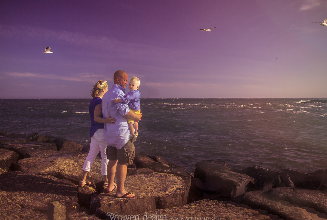
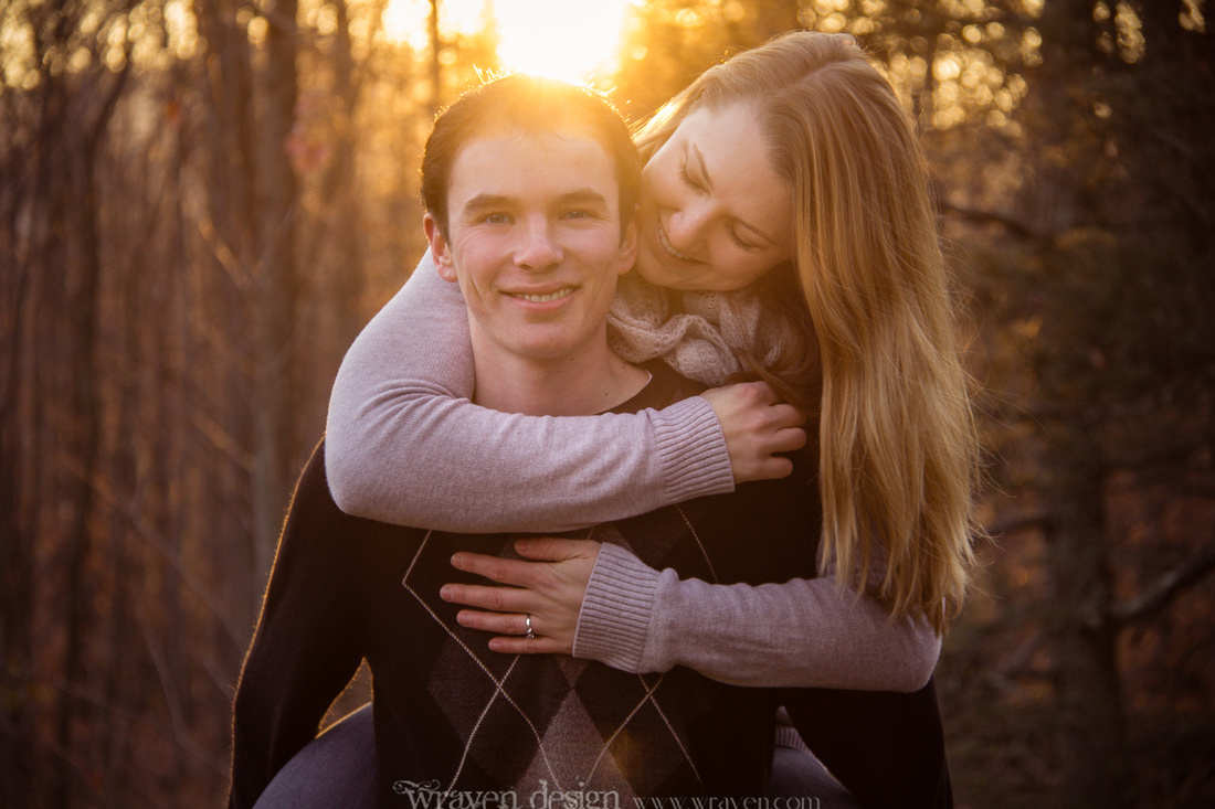
Wardrobe choices are vastly different when creating wall canvases vs birthday party invites or holiday cards. Date-specific items can and should feature seasonal wardrobe, holiday color schemes and weather-appropriate clothing choices. You wouldn’t want bathing suits on your Christmas cards or the family in red & green for your summer birthday invites. However, when creating portraits for long term in-home display, a more neutral approach is advised. This is NOT to say everyone should break out the jeans and white T-shirts (…please don’t.) Choosing colors that are found in the room of your home that you wish to display the photos is a perfect way to help wall portraits feel like they belong there and are part of your home’s decor. Colors should however remain fairly muted or neutral so portraits can convey if the décor in your home happens to change in a year or two.
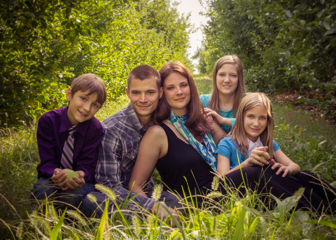
Should we all match?
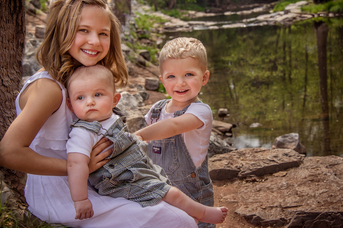
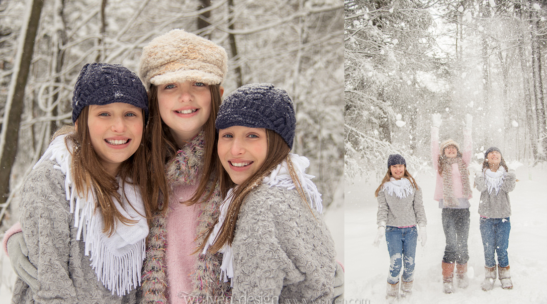
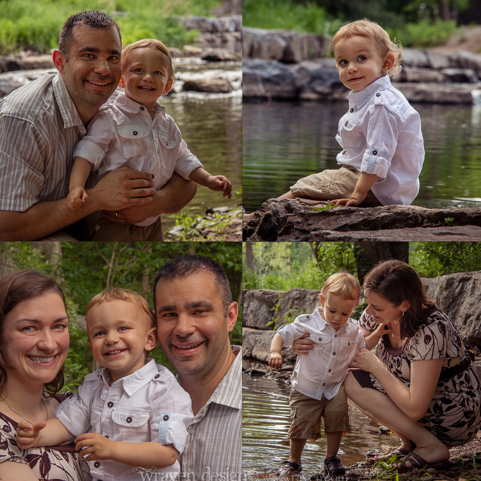
If the session is for a family, couple or group of children, this question often comes up. The short answer is I would suggest coordination over matching. Choosing a color scheme of three or four colors will help family members look as if they all belong in the photo without being too “matchy matchy,” which looks dated and overdone. Try not to include all the same colored tops or bottoms either. Mom in a burgundy top while daughter has burgundy in the pattern of her skirt and dad in his tie is an example of a great way to spread out the color while bringing everyone’s outfits together. The exception to this rule is of course twins or multiples. It's fair game to match the outfits of twins and coordinate outfits with other family members.
 What colors should I choose?
I will always suggest neutral, muted, jewel tones or pastels over BRIGHTS. These colors are more likely to convey between changes in the decoration of one’s own home and also coordinate with Grandma’s living room and Aunt Jess’s kitchen when you share portraits with loved ones. There are also other issues with brights and neons to take into account. A frustrating side effect of the current trend toward 80s throwback neon is color cast. This is when the colors from clothing, blankets, and sometimes walls and other surroundings actually reflect on the skin of subjects in a photo. This is especially prevalent in babies and toddlers who tend to have “less neck,” placing their cute little cherub cheeks right in direct reflection of that bright watermelon pinky-orange shirt. A good photographer can avoid this in many lighting situations or at least clean it up in post but the process is time consuming and runs the risk of creating an over retouched look which effects the overall quality of your portraits. These neons often seem to glow with modern DSLRs and post-processing techniques as well which is distracting from the faces of clients which should be the focus of portraiture.
Do you recommend avoiding prints or logos?
Yes and no. A tiny logo on a polo shirt or a polka dotted skirt on one family member would be just fine. Mixing a ton of prints (an entire family in plaid shirts for instance) becomes busy, distracting and difficult to edit. Slogans, licensed characters and graphic Ts will definitely date your photos and take away from the overall longevity of your portraits. The exception to this of course is a “First Birthday” onesie on your tiny toddler.. those photos will always be from his or her first birthday so things of this nature are fine. Including characters can be problematic due to the fluctuating tastes of children as well. That Elsa T-shirt may be her very favorite thing EVER this week but next week she is all about Anna and you are no longer able to have family portraits on display without hearing about it from your precocious preschooler every five minutes. (Can you tell I have children?) Sticking to solid colors or subtle prints for portraits can avoid this issue of future frustration.
What if we want to do a theme?
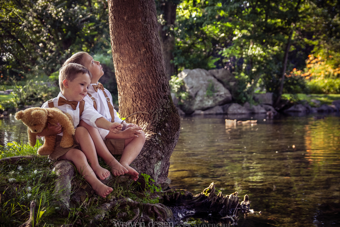
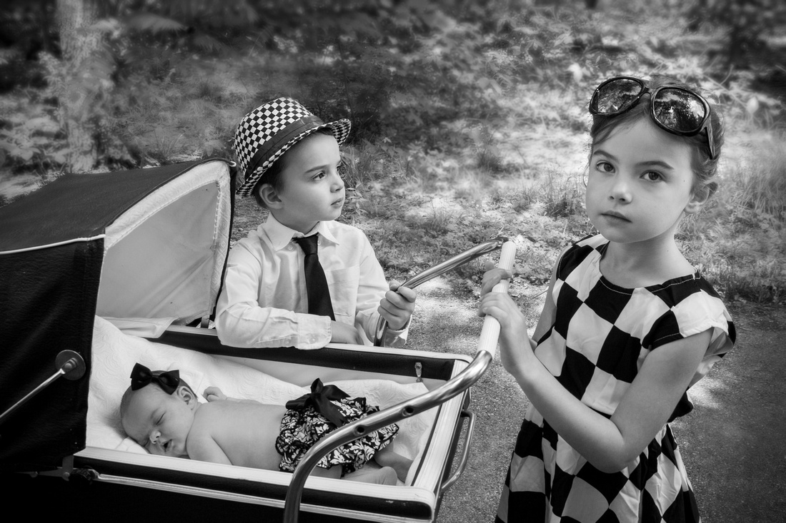
I LOVE this question. I am all about vintage styling and themes. I will always suggest adding timeless touches such as bow ties, suspenders, retro or classic jewelry and fedoras or newsboys caps to portrait wardrobe. I also advise choosing timeless shoe styles such as mary janes, boots, or even chucks/converse sneakers over obviously modern sneakers, crocs, or character-clad shoes. This same goes for coats. For fall or winter wardrobe, a pea coat or sweater will always trump a bright pink puffy Dora the Explorer coat for creating a timeless memory. A theme shoot such as a specific fairytale, book, movie, time period, etc. is also a great way to spice up portraits and create a unique memory for years to come. When considering themes, I always ask…
What do you/your children like?
It may seem obvious but finding out what a client is into is a great way to tailor a session to their personalities. You can plan the most detailed and perfect Cinderella shoot imaginable and it will turn out horribly if the little girl is a Sleeping Beauty fan and pouts in all of her photos. If you plan a rustic country barn shoot for a high school senior in a rock band, you’re probably getting angry teen face if not an all-out refusal to participate.. so always discuss specific likes and dislikes when planning themed shoots. Happy kids make for much better portraits.
What should I do for prep?
In addition to the clothing and accessories aspects of wardrobe there is the often overlooked grooming. Grooming, manscaping! Whatever you call it, it is vastly important. Nails should be freshly painted or completely void of polish, well-manicured or trimmed and CLEAN. Fingers and toes if they will be seen. Men should shave or shape their scruff or beards. I am all about facial hair if it is well manscaped but a straggly beard looks unkempt. All the appropriate shaving, plucking and waxing should be considered for women as well. This is especially important for boudoir photos. Now, that is not to say that everyone HAS to do these things. If you are a little more au naturel, that’s a personal choice. Just be aware what will show up in photos.. if you don’t want it there, please do your best to groom it away beforehand. Your photographer will thank you profusely. Conversely, scars, beauty marks, moles, etc that you WANT in photos, please inform us of this beforehand or during the shoot so they don't end up being mistakenly edited out.
Additional tips:
Clients should avoid messy/staining foods and beverages before sessions as well. Kool-aid mouth and spaghetti-o face are as problematic and frustrating as the neon color cast issue. I will often have extra wipes on hand for last minute messes.. kids happen.. but I encourage clients to avoid anything that may stain, just in case. This also includes mid-shoot beverages or rewards. I am absolutely not above doling out cheerios to appease a fussy baby. They are small (limited chipmunk cheeks), easily eaten quickly, and make minimum mess. Rewards such as lollipops, M&Ms or gummies are advised against due to the food dye mess and stickiness on faces, hands and props or wardrobe.
All told, wardrobe and details are an essential conversation to have between client(s) and photographer. Always ask if you have questions. Discussing even the silliest detail before a session can make all the difference in the finished portraits.
For additional inspiration, please visit Wraven Design on Pinterest for wardrobe idea boards.
http://www.pinterest.com/wravendesign